To fully appreciate and see the light, there must be darkness and aside from the dynamics of aesthetics, far too many of us battle some form of metaphoric darkness. The news, politics and shady politicians, catastrophes, terrorism, crime and wars all bring plenty of darkness to our lives. and just like a human figure, beautifully innocent to all the darkness yet exposed and vulnerable, we all have very little to withstand the overwhelming darkness all around us. Today’s world can make it difficult to hold on to self worth, self respect, motivation and even a joy of life. That’s darkness.
But… there’s light
It’s easy to forget how light changes almost everything. There’s a renewing power in light, it brings hope encouragement, strength—and life.
Living in Scandinavia, summers are short, sun and light is appreciated by most—myself included—it just feels good and in light there’s beauty. This makes me look to the light for so many reasons and visually—well, light is essential and while fearing to repeat myself, beautiful.
in this setting, the light so perfectly defined the pure lines of the figure that I stopped everything and immediately asked the model to hold still—to which she promptly replied that she was quite comfortable where she was and wasn’t about to move anytime soon. The sun was nice and warm and she figured she could lay there all day—besides, she said (tongue in cheek)… it’s a nice little break away from the kids.
Wanting to remove all distractions and to make the light stand out more clearly, I toned down all color— essentially to the point of the composition being monochromatic, nearly without any middle tones. This left the beautifully lit torso almost drowning in overpowering darkness, with just enough light to draw our eyes to the clearly defined contours—though sufficiently lit in contrast to the surrounding darkness to allow an innate yet intangible light to remain, and shine.
… and, that’s the light.
To bring the light to life, only an ultimate stark contrast could make that light shine–aesthetically and metaphorically. When in the depth of darkness, light becomes a rare, sometimes barely visible treasure—yet with the potential to push back even the most overwhelming darkness, a darkness so intense as to seemingly allow no light, threatening to suffocate all life–that’s when light shows its true worth and strength. But, there must be darkness for light to truly shine.
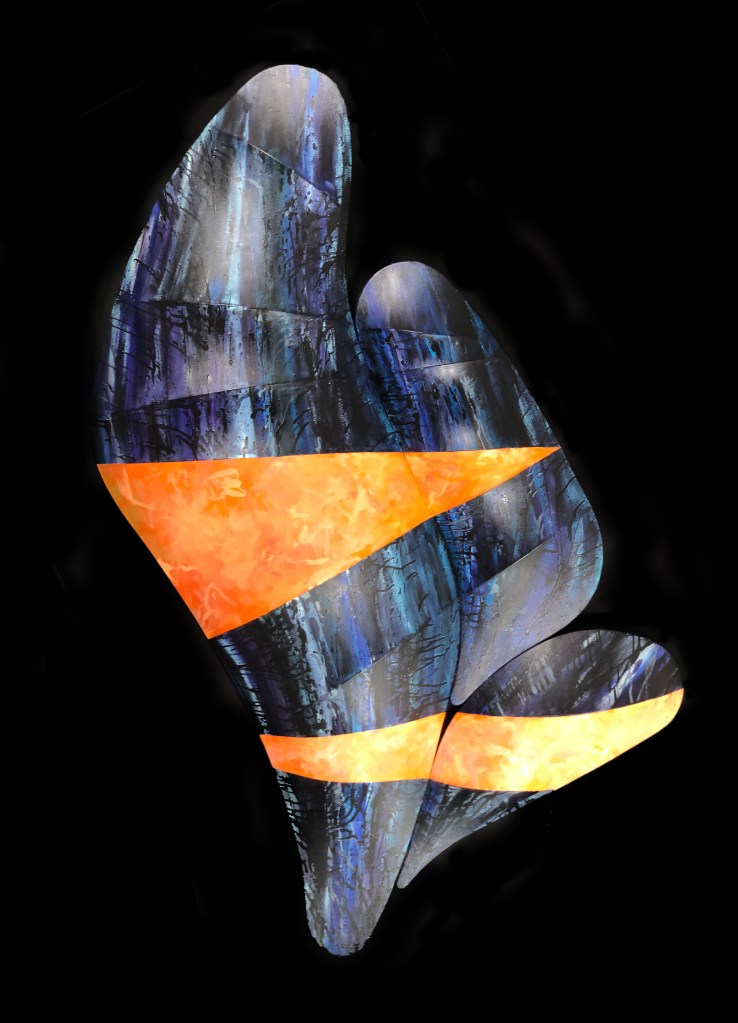
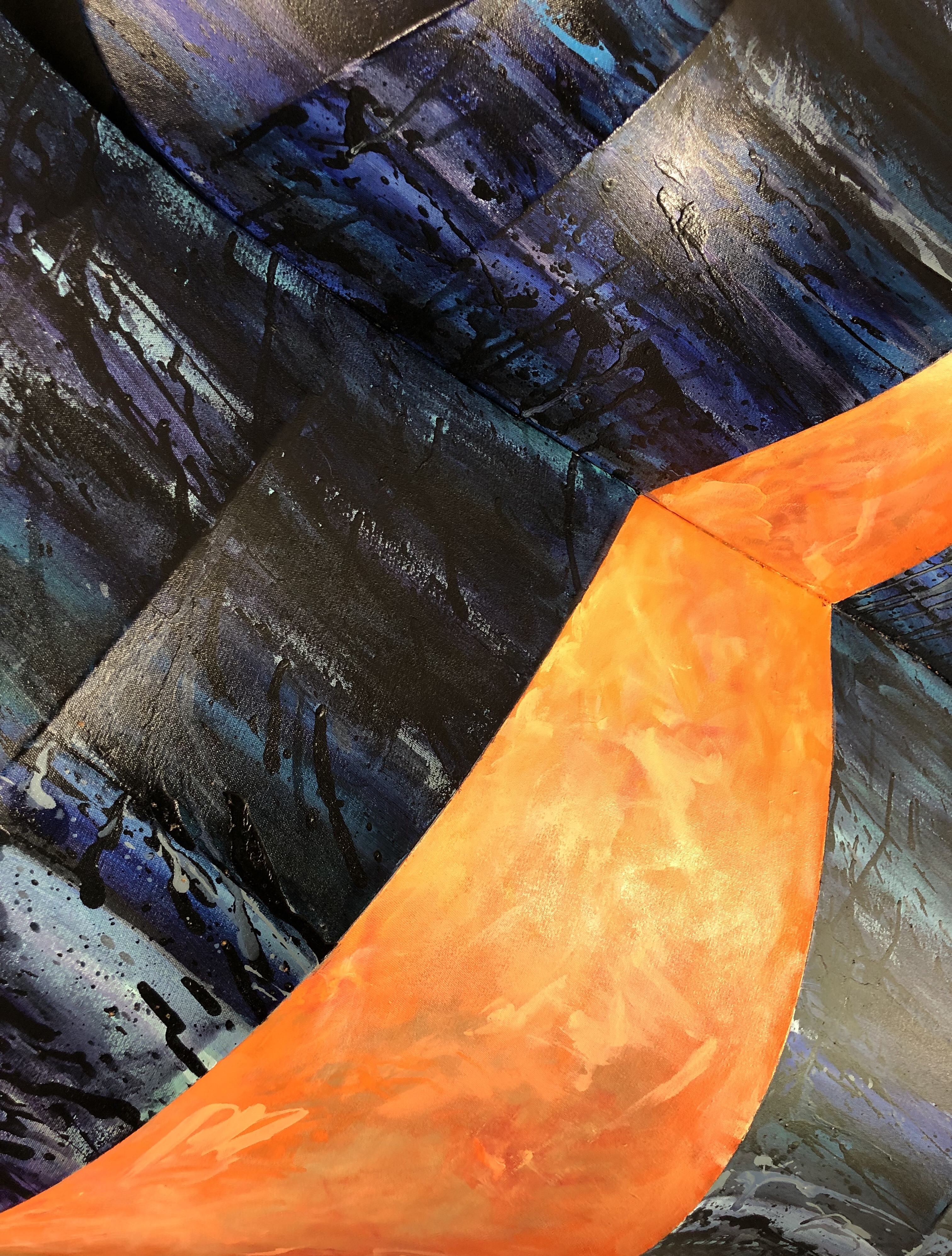
While planning and thinking out this project, much of my focus was on discovering the potential and nature of the canvas. Instead of the usual flat, and mostly discrete role as a ground to hold paint, canvas holds enough character and aesthetic qualities to be a lead player once a third dimension is added. Letting the canvas have a voice does however make it nearly impossible to ignore the more sculpturally inclined canvas, if applying any other media.
While tempting to let the sculptural qualities of the canvas get all the attention and leave it blank– allowing light and shadow to make its own art, I went through many stages before deciding. Any approach to painting these structures had not only to justify the sculptural qualities but be a means to help the viewer truly see, and appreciate the aesthetics of both shape and chroma, or there would be no balance.
But, after a lengthy process–I’m finally at peace with the result.
–
—
The rectangular dimensions listed with the photo, are only for crating and shipping purposes. If “Changes” is to be displayed as in the above photo it measures a full 254 cm from top to bottom.
Getting a little closer and on a slight angle, should help improve the perception of what otherwise could be seen as an entirely two-dimensional object?
The arduous process required to bring about these structures makes photographing them seem like a reward, frequently opening up an all new perspective to me. Once transferred to a two-dimensional format, the different viewing angles takes on a unique character, with an entirely new aesthetic value–conceptually connected, yet entirely separate from the original.
Spring is all about the return of light, and that deep warmth of the sun, once again bringing hope and rejuvenation after a long winter.
As we emerge from hibernation, reclaiming our gardens, it’s difficult to resist that life-giving light. The sun seems to warm our very souls, bringing fresh colors and beauty to our surroundings, making it nearly impossible to hold back a little smile. A relaxing day in the sun. warms not only our bodies but also our hearts, reminding us how much we’ve missed the strength found in light.
This piece is to celebrate spring, as we recover from a long and cold winter, the universal inclination to step outside, embrace the returning light, feel the warmth—to fully take in the rejuvenating rays of the sun after a long dark Winter.
As an artist, I find great inspiration in the human form and what better way to celebrate tis beauty and expression than bathed in the warming sunlight of Spring. The beauty of the human figure and its limitless potential for expression through body language, a powerful medium in itself, is what draws me to work with it. Body language holds the potential to express what words cannot, and this is a responsibility I take seriously in my work.
I meticulously direct the use of body language in my paintings, working carefully with the model to create a piece that expresses the emotion and feeling that we often struggle to put into words. In the case of “Maestosa,” the pose of the figure exudes an inner strength and confidence for the viewer to comfortably share, in a moment of peace of mind and inner fortitude, ready for whatever life may bring.
Picasso’s Bulls as seen at the Gagosian Gallery, London (exhibition curated by Sir John Richardson)
When I visited London some time back, I also had the good fortune to see the Picasso (1881 – 1973) exhibition curated by Sir John Richardson “Minotaurs and Matadors” at the Gagosian Gallery. It’s woth noting that Richardson holds some knowledge on the matter of Picasso, having authored several biographic volumes on Picasso (as displayed for sale at the exhibit) and as longstanding personal friend of Picassso.
Picasso’s Bull Series
Despite having seen many of Picasso’s works exhibited before (an entirely different and much more impressive experience than seeing them in books or online) this once again allowed me a grand experience. Here I saw Picasso’s series of bull drawings, a sequence as if made specifically for use in teaching the process of reduction in art and design.
While an excellent instrument for teaching, there’s perhaps more to be understood from this series of drawings than a few concepts of design and reduction. Picasso often made it clear that he identified with the bull, making his bull drawings particularly interesting when the choices made in this reductive process is entirely Picasso’s.
To better understand Picasso, his choices and works, it helps to consider when he was born: In 1881 Brahms was still doing concerts, Edgar Degas organized and opened the Sixth Impressionists Exhibition in Paris–showing his sculpture “Little Dancer,” Billy the Kid escapes from a New Mexico jail, Sitting Bull surrenders, there was the now famous gunfight at the OK Corral, Thomas Edison and Alexander Graham Bell formed The Oriental Telephone Company (landline telephone,) Barnum & Bailey Circus debuts at Madison Square Gardens—bullfighting was alive and well, even popular and not yet considered offensive.
In Picasso’s homeland Spain, the bull was a prominent part of their culture and while difficult to imagine today, bullfighting was entertainment. Bullfighting was a part of life and if Le Petit Picador (1889,) painted by Picasso when barely eight years old, can be any indication— bullfighting already made an impression on the young Picasso.
Picasso’s fascination with bullfighting continues and becomes a factor impossible to ignore, right from the blood and gore of bulls and horses of the bullfight, to when the bull meets its end—as dealt by the matador.
Returning to Picasso, metaphorically identifying with and relating to the bull or better yet–the minotaur as half man, half bull said “If all the ways I have been along were marked on a map and joined up with a line, it might represent a Minotaur.” In Picasso’s world, the bull portion of the minotaur was ultimately destined to fight for its life and die fighting–while the man portion of that same minotaur still tries to make sense of it all.
Bullfight Symbolism
It could seem that every element of the bullfight held metaphors for Picasso, perhaps helping him to see his person in a more objective light—as the bull with all its gesturing, charging, huffing and puffing rarely wins but always fights a fight worthy of respect.
With all the cheering and commotion at a bullfight, Picasso would sit quietly through it all—as he identified with the bull, perhaps all too aware of its impending fate. For the bull it’s a fight for life and death, for the matador it’s for show and for the audience, entertainment, even with all its grotesque gore—and Picasso is the bull in his very own bullfight, to give the performance of his life and to personally pay the ultimate price. Even the horses often sacrificed in a bullfight takes on meaning, as Picasso himself sees them as a metaphor for the woman that became victims of his choices and life.
In his bull series, Picasso takes on his usual role as the artist to expertly select which elements of the bull to include or exclude, and where to draw the focus of the audience. As the number of drawings increase a progression begins to show, as detail gives way to form and design–all with the intentions of finding those essential elements of art in the subject. Picasso’s search for form and design, dissecting this subject (a bull, likened to himself) to find the art, is at this point not so different from a philosopher’s search for truth in the essence of a concept.
While the process involves an obvious reduction of elements, what’s barely noticeable at first is the price of this reduction—as the process nears the end. Intentionally or subconsciously, it becomes more apparent that art has a price.
As is frequently seen in design and icons, the bulls head is often used to symbolize unstoppable strength, mind, mentality and tenacity—clearly identifying the idea of a bull.
Picasso’s Personal Reflection
For Picasso, the symbolism of a bull’s mask was enough to suggest himself a bull when wearing it. While the later reduction in size of the bull’s head could be seen as a coincidence if a singular rendition, this was rather a gradual, consistent and therefore deliberate change. For Picasso, having associated himself with the bull and particularly the bull’s head, it would seem a fair guess that he saw his mindset to be like of a bull’s. The later reductions of the bull’s head in Picasso’s renderings would likely suggest that he experienced a gradual reduction of capacity and motivation, perhaps as brought on by age but here to the point of nearly being completely gone.
As can be concluded when viewing the Charging Bull of Wall Street sculpture other parts of the bull also has great significance. The genitals of bulls are often used to refer to the character and traits inherent to the masculinity and strength in a bull, just like people in some parts of the world compare themselves or parts of themselves to that of a bull.
Surprisingly, in a final stage of reduction—as if to make the biggest statement yet in the last drawing, Picasso almost completely castrates the bull by now drawing the genitals so small as if no longer of any significance or use.
The drawings are indisputably Picasso’s recorded expression as he chose every step of the way, which brings me to question if this was a statement on more than elements of design and abstraction, intentionally or unintentionally? Was this a commentary on art in general, the art world, or was it personal reflection, a visual autobiography (Picasso was never a man of many words?) Did Picasso perhaps feel burdened and/or drained from his own success, as he inescapably became a greater celebrity, seeing his identity, real strength and artistic freedom reduced to the point of being almost removed?
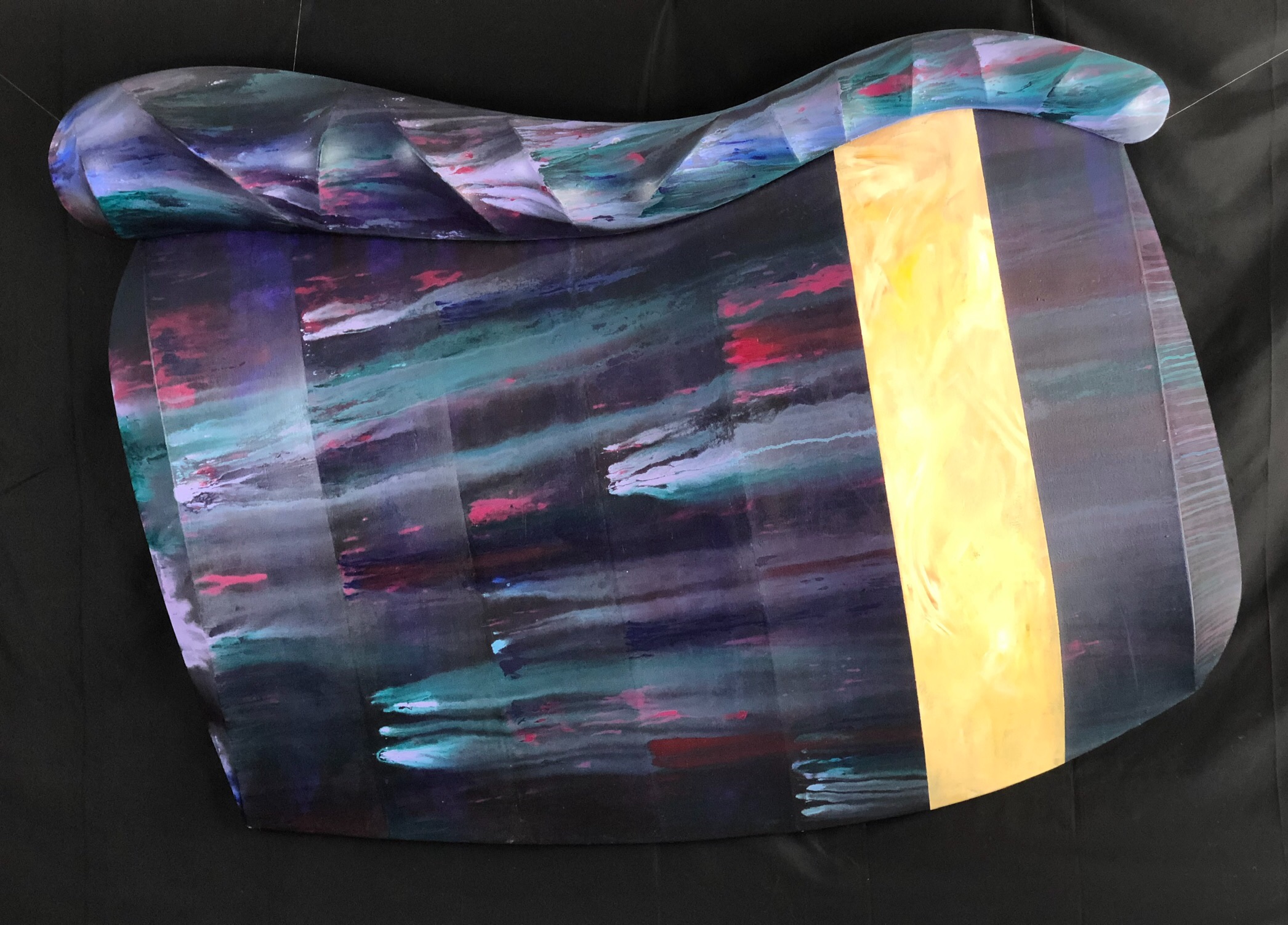
“Rainy Day Monday” Diptych, acrylic paint on a 3D canvas.
When I first photographed this piece in the garden for my Instagram account, it quickly became a matter of timing, wiping off drops of rain and rushing to take more pictures before the next drops began to fall. I finally thought we had succeeded and posted the pictures, only to find that the painting still had some droplets left, some partly wiped off and others not so much. After all the work preceding my rainy day photo session, a few drops of rain ended up giving name to the piece.
Before I had to fight the weather to photograph this piece, it had to be formed, first in my mind and then in the studio. I wanted to free myself from the conventions while still using conventional tools to do so, and what could be more conventional than paint and canvas in art–so that’s where I began.
The canvas, often referred to as ground, typically given a barely mentioned passive role and stretcher bars, discrete supports for the ground, could instead be called on as media, all working together, not to just carry a medium but all be equally significant media.
Much thought and experimentation came before the actual conceptualization of my idea but I wanted paint, canvas and stretcher bars to be media–all merged into one expression. For canvas and stretcher bars to be considered of value, their characteristics had to be considered and properly displayed to qualify as media.
But, with multiple media there must be a balance and when both stretcher bars and canvas explode into view, demanding attention, the painting must be equally explosive.
Photographed under different circumstances, away from the rain and using in-house lighting, here is my first realization of what began as merely an idea, challenging myself, wondering if in bringing out the characteristics of canvas, how far it would stretch–and still not rip or get wobbles (the rips and wobbles are maybe for another painting, another day.)
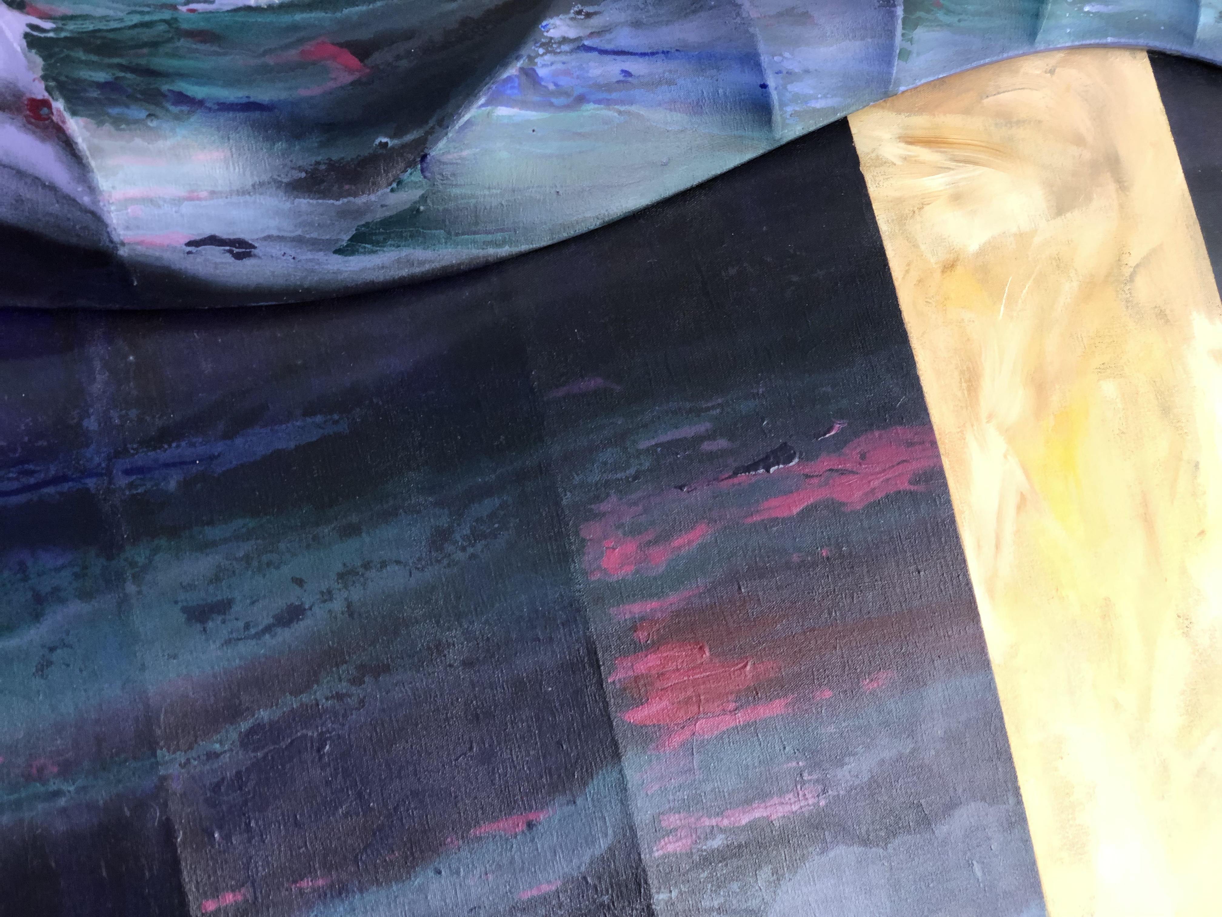
“Rainy Day Monday” Diptych (detail #1,) acrylic paint on a 3D canvas.
I wanted to show the nature of the canvas, taking it to the extremes as in life’s highs and the lows. Colors, some more pleasant and harmonious and others not so much—almost in random chaos, like those events around us that color our days, with sometimes bright cheer and other times rather undefinable hues—yet still following those forever unavoidable, highs and lows.
My attempts at trying to control my photos of this piece soon became a loosing battle, that instead served to show its true nature, with form and chroma both struggling to dominate. The tension in the fauve colors demands to be seen, though constantly suppressed by the multifaceted canvas, ready to reflect any incidental light. Depending on available light, the composition migh insist that you see form over color, making the experience entirely dependent on where and how it’s displayed.
I added a band of subdued yellow, that all depending on the viewer can hold a multiple of meanings. But, no heart or set of eyes are the same, as are no two lives—our difficulties vary, as does our hopes and needs.
“Rainy Day Monday” Diptych (detail #2,) acrylic paint on a 3D canvas.
Using close-up details of “Rainy Day Monday,” I wanted to share the experience and dynamics of this piece, changing my angle of approach as much as possible from photo to photo. For the sake of authenticity and honest depiction, I used daylight lamps (5500/5600 Kelvin) and allowed the light from my garden window to blend with the light of the lamps, still the colors varied from photo to photo? It may seem unlikely but I’ve used no altering filters, to fully allow viewing to be as natural as a camera possibly can.
“Rainy Day Monday” Diptych (detail #3,) acrylic paint on a 3D canvas.“Rainy Day Monday” Diptych (detail #4,) acrylic paint on a 3D canvas.“Rainy Day Monday” Diptych (detail #5,) acrylic paint on a 3D canvas.
The colors of detail # 4 and 5 are the closest to how I see them myself in the painting, I hope that helps?
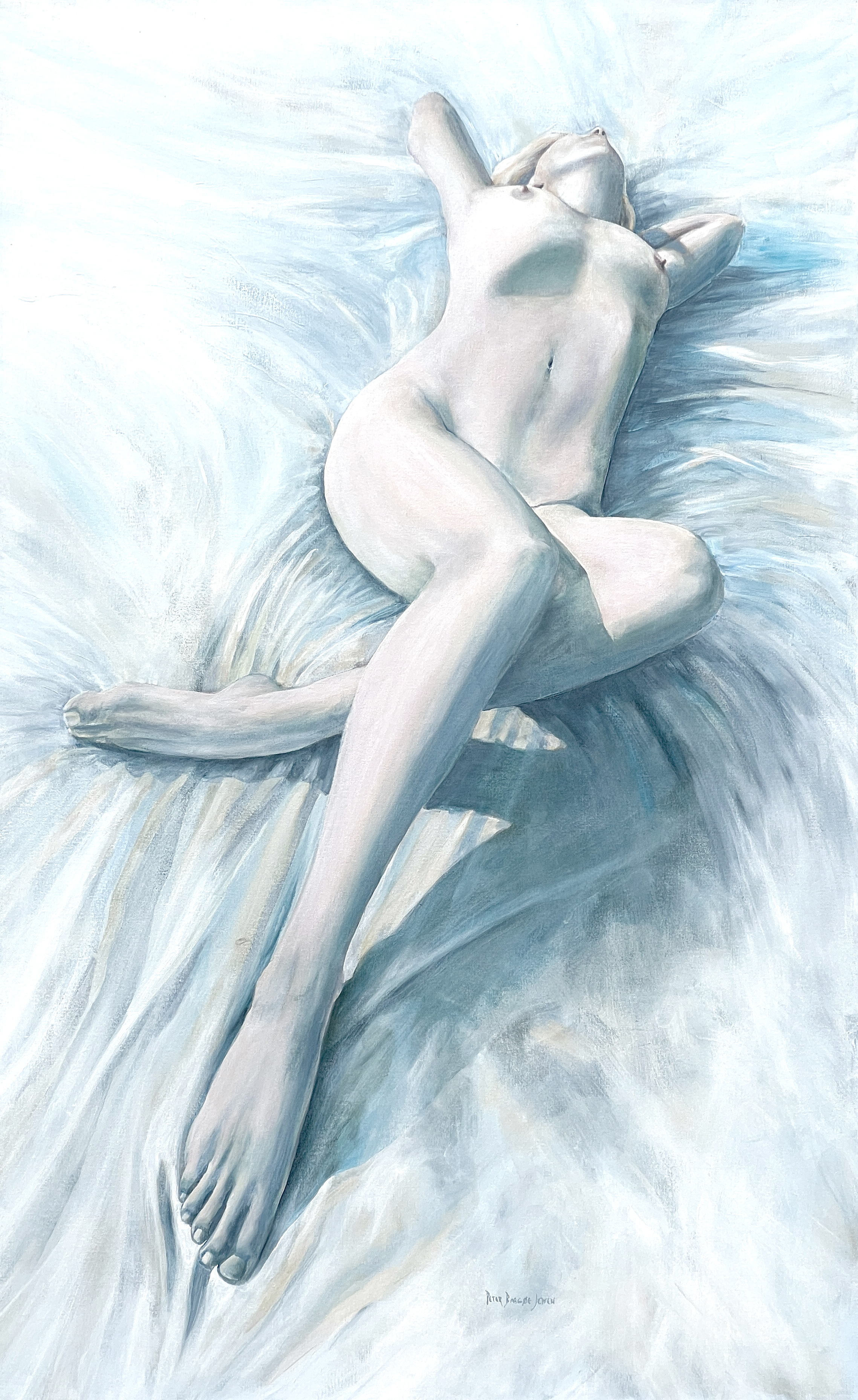
I see human anatomy and form as the most impressive work of art there is. We make choices and accessorize—some to blend in, some to stand out from the crowd. Regardless of our attempts to enhance, disguise or cover our anatomy, there’s no escaping that our particular anatomy to a great extent serves in describing our person. We can add personality, education, degrees of fitness, layer up with expensive makeup and haute couture but the characteristics of our person and figure remain the same—our figure is very much about who we are, our person and that’s what I seek to draw attention to with much of my work.
I’ve typically focused on the human experience, intending to bring a quiet and perhaps peaceful feeling or mood across to the viewer by composing the figure accordingly—but not this time.
Here I addressed the figure, beautiful as it may be all on its own—as a medium, not so much a person, not expressing a feeling or setting a mood but as a medium to serve an aesthetic aim.
I aimed to sculpt the intrinsic qualities of the figure: form, light and shadow into a new and almost independent object of art—and I quite like the result.
The cold and solid stone walls, nearly a millennium old would seem impenetrable if not for a small humble window, yet sufficient for life and warmth to pass. Once inside, the light awakens the room with life.
The connection between figure and light lends significance to the light, so perfectly defining the beauty of the figure as it competes with the light itself for the viewer’s attention.
The the monochrome and cool tones of the room in stark contrast to the strength of life shown by the chromatically strong warmth of the female figure, that even at its unprotected and most vulnerable state can bring life to the coldest and darkest surroundings.
While I can never come close to create anything as beautiful as the human form, I try to share my perception in such a way as help the viewer see that same beauty in a different light, with a different set of eyes.
I was impressed with how the bright sun becomes its own aesthetic, defining the figure while adding an almost marble-like tone to the skin and I’m rather pleased with the result. Much to the models surprise, I gave her red hair in this painting but it just seemed the right thing to do?
My admiration for the figure should never be misunderstood as ambition to imitate the function of a camera, and why should I? The camera already does accurate depictions expertly, much faster and without compare.
Instead I merely aim to share my respect and admiration for the endless variations of beauty I see in people around me.
Sunny days allows us to better see color, perhaps more so after a long dark winter but with color comes impact. Strong colors might dominate and become a distraction—I had to quiet down the colors, hoping to bring attention to the more ethereal qualities of light itself, while including the feeling of that deep warmth of sunlight as it reaches even your innermost core.
Then as if this moment was made just for this particular model, the light and the model came together in a perfect symbiosis, stretching and posed to express both the relaxing warmth of sunlight and that deep inner lift from being in the sun—the feeling that everything is just right.
Soaking in the sunlight is a marvelous feeling, and I wanted to share that feeling, the energy found in light—a warmth that goes right to the bone, fueling life itself.
It’s a good day in the sun, easy to enjoy—relaxing and recharging. It’s is really all about that feeling of being just you in the warmth of the sun, with no disruptions or distractions.